|
The continuous chart
The CONTINUOUS CHART is the simplest chart. It consists in
connecting the closing prices on a single line. With such a chart you can quickly
realize of the general evolution of the stock.
To obtain more information such as the open price, the high and low price
during the day, you should ask for a bar-chart or a Japanese candlestick.
A continuous charts makes it possible to define support and resistance
lines .
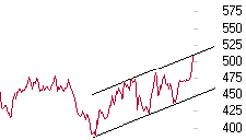
example of continuous chart
> Back to the table of contents
The bar-chart
The Bar-chart consists in sticks.
Each day is represented by a vertical stick.
-
the height of the stick
represents difference between the high and the low price during the day
-
the feature on the left
of the stick represents the open price.
-
the feature on the right
of the stick represents the close price.
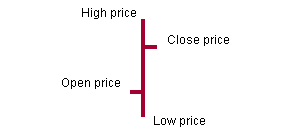
example of Bar-Chart
> Back to the table of contents
The moving average
The MOVING AVERAGE is calculated with close prices. It is used to smooth the evolution of the chart.
The interest of the average is to highlight the cycles of rise and fall of the studied value.
> Back to the table of contents
The moving average oscillator
The MOVING AVERAGE OSCILLATOR OF is calculated by making the difference of two moving averages.
> Back to the table of contents
The bollinger bands
BOLLINGER BANDS are curves drawn in and around the price structure
that provide relative definitions of high and low. You can get a definition of the Bollinger on http://www.bollingerbands.com
> Back to the table of contents
The momentum
The MOMENTUM is equal to the difference between the today’s close
price and the close price X days earlier.
> Back to the table of contents
The RSI
The RSI or Relative Strength Index is an oscillator between 0
and 100%. 0% means the stock is oversold. 100% means the stock is overbought.
> Back to the table of contents
The volatility
The VOLATILITY indicates the capacity of a stock to be up and down. Volatility is expressed in %.
> Back to the table of contents
The stochastics
The STOCHASTICS represent on a scale from 0 to 100 % the position of the close price compared to the high
and low price during the day.
> Back to the table of contents
The MACD
MACD (Moving Average Convergence Divergence)
is based on the calculation and the crossing of three moving averages : 12, 26 and 9 days.
> Back to the table of contents
Parabolic
The PARABOLIC model draws high and low parabolas on both sides of
the close prices. This model is based on high and low prices
> Back to the table of contents
The japanese candlestick
The JAPANESE CANDLESTICK, like the bar chart, represents for each
day on the same chart the open, high, low and close prices.
The difference intervenes in the materialization of the position
of the closing price compared to the opening price.
To represent a day (a candle), draw "the wick" by
connecting with a vertical line the high and low prices. Then draw the body of the candle using the close and open prices. The candle will be painted
if the close price is lower than open price. The candle will be left blank in the contrary case.
> Back to the table of contents
|